This is Part 7 of 8 in The Projects AI Makes Possible, a series about building a private almanac from a 1992 geography game with a coding agent. In Part 6: AI Solved the Problem I Pointed It At. I Had Aimed Too Narrowly., testing with gameplay revealed a missing set of source data. After resolving that and successfully using the almanac for a few playthroughs, I had one final step before calling this complete: deciding what should actually make it into the product – and what to cut.
“It is only by selection, elimination, and emphasis that we get at the real meaning of things.”
Georgia O’Keeffe
By the time the almanac worked, the project behind it had become enormous. Two parallel pieces of work had grown throughout: an ever-expanding research workspace and, more slowly, the product itself.
The research workspace held extraction manifests, one-off programs to extract and reformat data, decoder experiments, groupings of images for review, various attempts at maps, a database, data review artifacts, and notes on different directions we could take. Hundreds of image files had accumulated along the way, many of them failed experiments that were still useful as evidence.
The agent had made it inexpensive to create all of that. It could build another review page, preserve another branch, or explore another feature simply because I prompted it in a direction.
In the product itself I similarly had cast a wide net to start, intermingling the almanac with the review databases, pages, and some speculative experiments. Now it was time to narrow the functionality to just what enhanced the experience while playing the game with it.
The product question was no longer what else the agent could build. It was how to whittle what we had built down to the most relevant and useful parts.
The Mess Still Had a Job
The experiments we tried explored many different directions, while the product should be intuitive and almost disappear.
Earlier, when I tested the output and compared it to what we had extracted, I wanted to be able to see everything and easily navigate from the almanac all the way to the sources and reasons for how, where and why the agent had gotten and included each piece of information. Resource IDs helped us connect files. Raw links let us inspect an extraction. Decoder galleries made it possible to compare groupings of images and recognize the one that was getting close. Review tables showed source sentences beside rewritten facts.
While iterating and researching, those artifacts helped us work together, and having a way to drill down to them from the almanac itself helped me audit, test and trace things back to their source and see them in context. The finished almanac, however, only needed them as source material. Once I trusted that the data was good, I could focus on the user experience.
What Survived the Cut
The country page gradually reduced itself to a short list:
- A flag
- A modern regional map
- A small fact box
- The rewritten country information
- Additional facts that explained searchable phrases
- Search
There were also small usability quirks we discovered in testing early iterations, which we gradually polished. Initially countries appeared in the order of their internal IDs. Pages exposed links and labels that tied back to source extraction work. Long sections pushed the search box off the screen.
These usability defects became apparent as we started playing with the almanac, and I worked with the agent to resolve them one at a time – with fixes often straightforward. Countries became alphabetical, with the capital shown before the continent. We made the sidebar collapsible to create more room for the article, and kept its reopen control on the left so it still read as a sidebar control rather than the main menu. We made the search remain visible while the page scrolled.
The search widget also improved through iteration. Pressing Enter originally jumped directly into the first match even when several results were plausible. In the finished version, the search displays multiple matching results but waits for the reader to choose. The selected result then opens the right country and moves to the exact explanation instead of dropping the reader at the top of a long page.
Those details were less technically dramatic than decoding an undocumented image format. But when we used the almanac during a game, they made the experience much more pleasant and brought it closer to the goal of becoming intuitive enough to disappear. It was also a lot of fun asking the agent to fix it as we were playing, and during the course of the case, reloading the page and seeing the changes immediately applied!
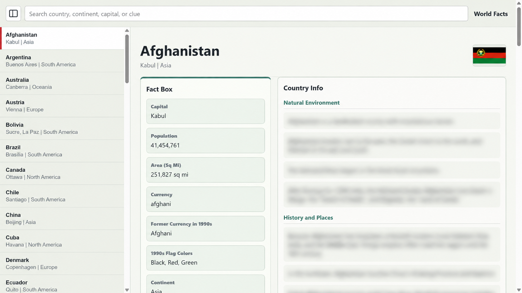
The resulting site was only about ten megabytes, and most of that was the thirteen regional map images. The facts and search material were small enough to load directly in the browser.
That meant the almanac did not need user accounts, a server-side database, or an API. Initially I thought I would deploy it as an app installed on the tablets, and perhaps in the future I will pursue that. However, the static site we built “just to test” actually performed remarkably well. It was fast, easy to cache, inexpensive to host on a local server (or one of any number of free or inexpensive web hosts), and required no personal information from the children using it.
For a bounded reference collection like this, the static site was totally serviceable as an MVP.
Some Successes Weren’t Features
For all my excitement about our breakthrough decoding the scenic images, they did not make the finished version. Recovering them had been a meaningful part of the project, and the experiments taught us how the old resource files worked. But they did not add anything to the experience, and the game already displayed them when we visited each country. We also had working background audio, but it did not improve the tablet experience enough to justify inclusion and yet another widget on the page, especially since the game itself already played it.
While that work did not make the final product, some of what we learned along the way influenced other parts of the product. The image decoder had answered a technical question and ultimately let us decode the source maps. The audio experiments proved that the old sound records could be understood.
And ultimately, the journey I took in getting to the end goal was enjoyable – unlocking parts of the data files and being able to independently load and play them was a fun reward unto itself.
The experiments and review tools were still there if I wanted to return to them. They just no longer needed to be part of the almanac we opened during a game.
]]>“Your life reflects what you tolerate.”
Tony Robbins
When I first moved and got my car, I missed the aux input from my old stereo. With an aux input, I could plug in my phone, listen to podcasts, and make my commute feel a little more useful. I figured that once I was settled, I would replace the stereo.
Until then, I would make do.
The First Workaround
At first, making do was fine. I listened to the radio and old CDs. When I wanted to listen to podcasts, I shifted that habit to running instead.
That sort of solved my problem – sure I still had podcast listening time, but not during my drive. It also meant all the music and podcasts on my phone were not available in the car, just the same rotation of CDs.
The workaround was acceptable enough…and that’s exactly what I did, I accepted it.
The Better Bad Solution
Later, my dad gave me an FM transmitter. The sound quality was not good, but it was fine. However, it did let me listen to podcasts in the car again, so I accepted it.
The signal dropped sometimes. The volume was low. The experience was not good. But it crossed the threshold of tolerable, so I kept it.
Eventually I found a way to hang the transmitter cable from the visor, which improved the signal a bit. It looked weird, was a little inconvenient but the sound was better than before – though still worse than the real fix.
However that is how it remained, until years later when I purchased a new car that had an aux input and I hooked up a Bluetooth receiver. Finally – good quality, wireless, and easy for my friends to connect their music as well.
The Worst Acceptable Solution
Why didn’t I simply buy a new car stereo? Why did I let things continue the way they were?
Annoying but workable is where bad systems learn to survive.
Because – the system was not broken. If it were broken, I probably would have fixed it. But it was the worst acceptable solution: annoying, but workable enough.
So I adapted around it, accepted it – and just lived with it.
At Work, It Looks Familiar
In my professional life, I’ve seen the same thing – in software, often tech debt. Worse: tech debt that is continually built upon because the small annoyances and inefficiencies slow things down, but don’t stop enough impactful work.
Meanwhile, we know that the tech debt needs to be addressed – though unlike in my situation, unaddressed tech debt gets worse and worse.
Product quality with weird workarounds is another example. Small quality issues become accepted, and can lead to a new, lower normal.
That is the curse: once a solution is barely acceptable, it can become surprisingly hard to replace with a good one.
]]>